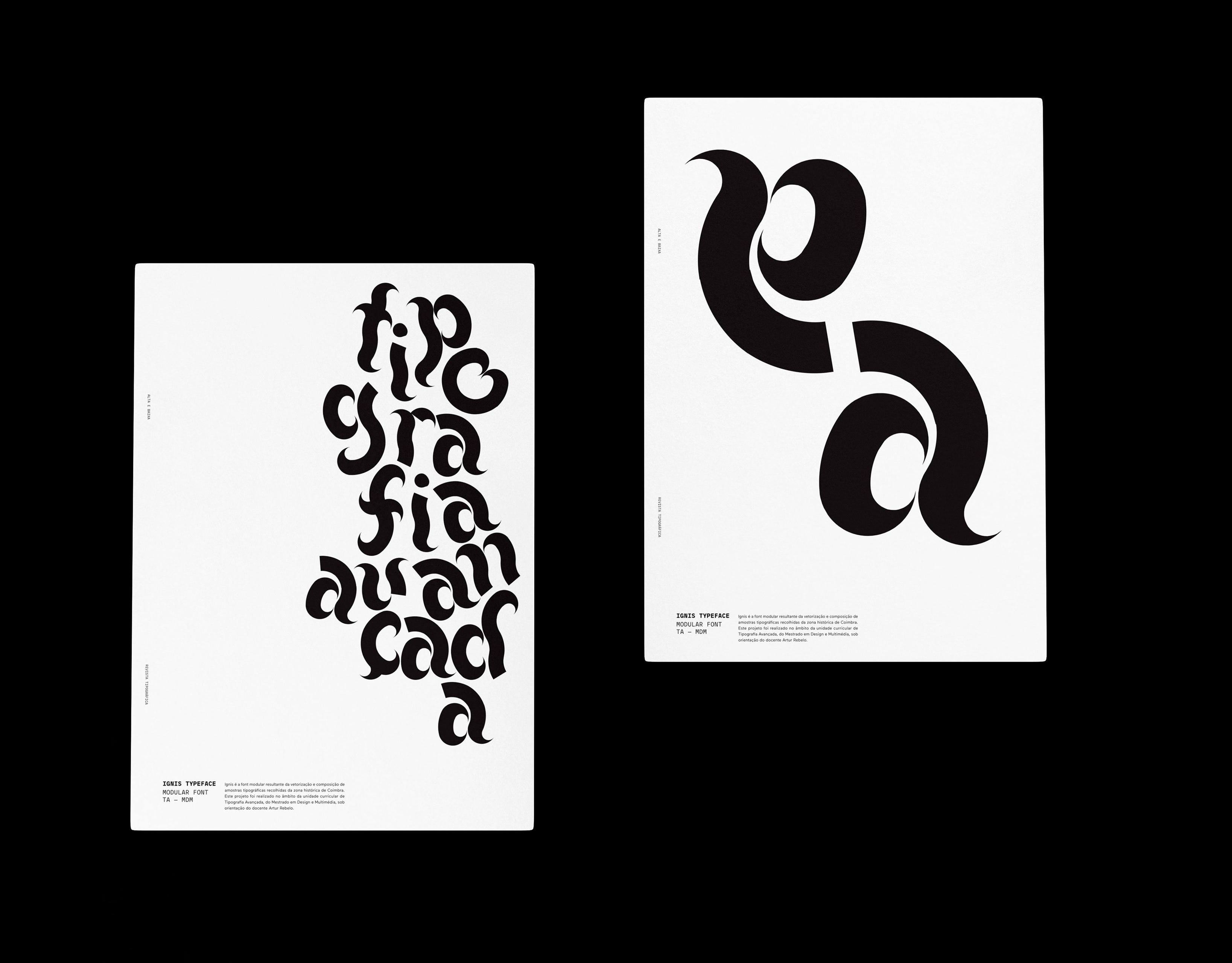
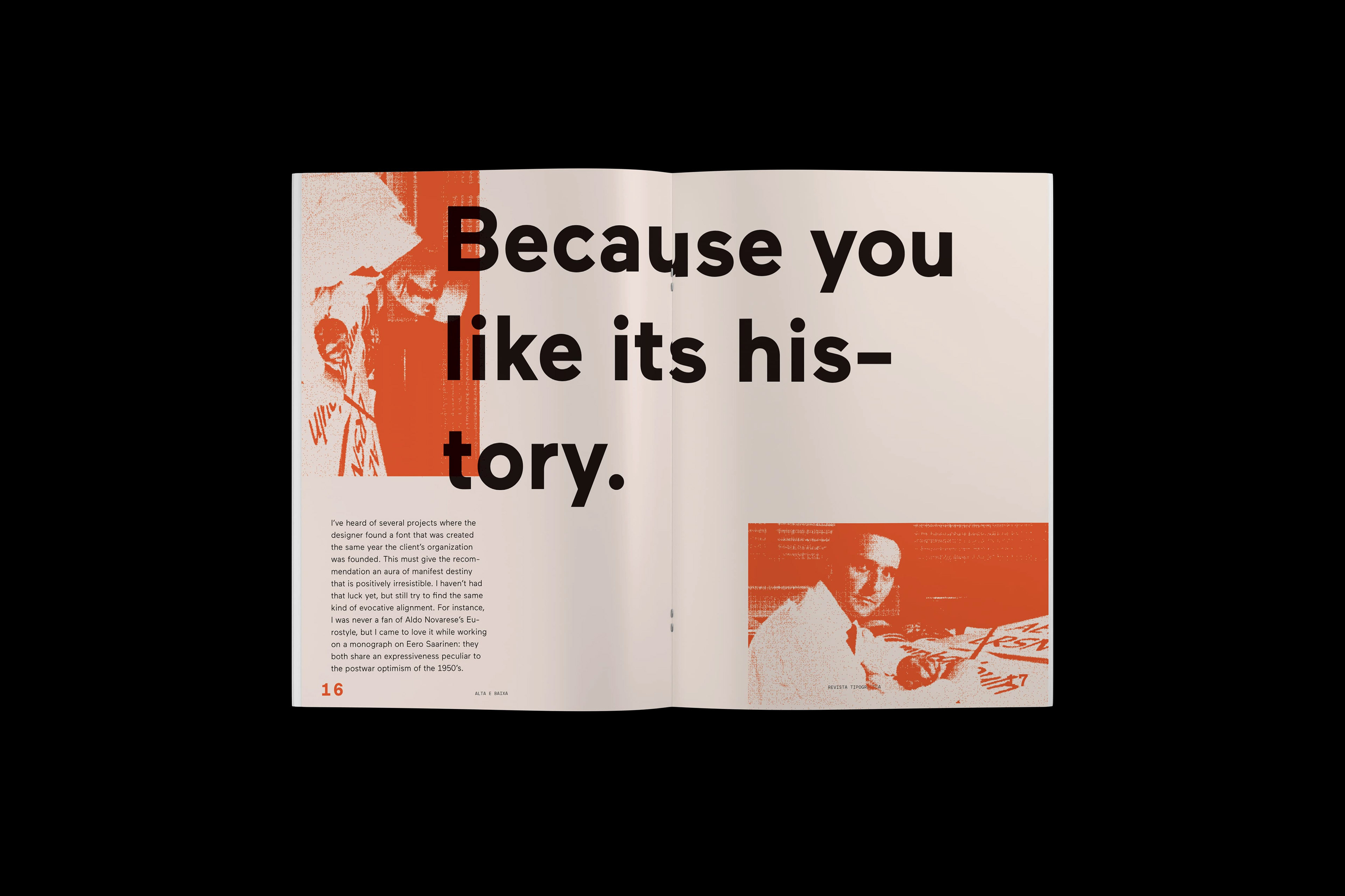
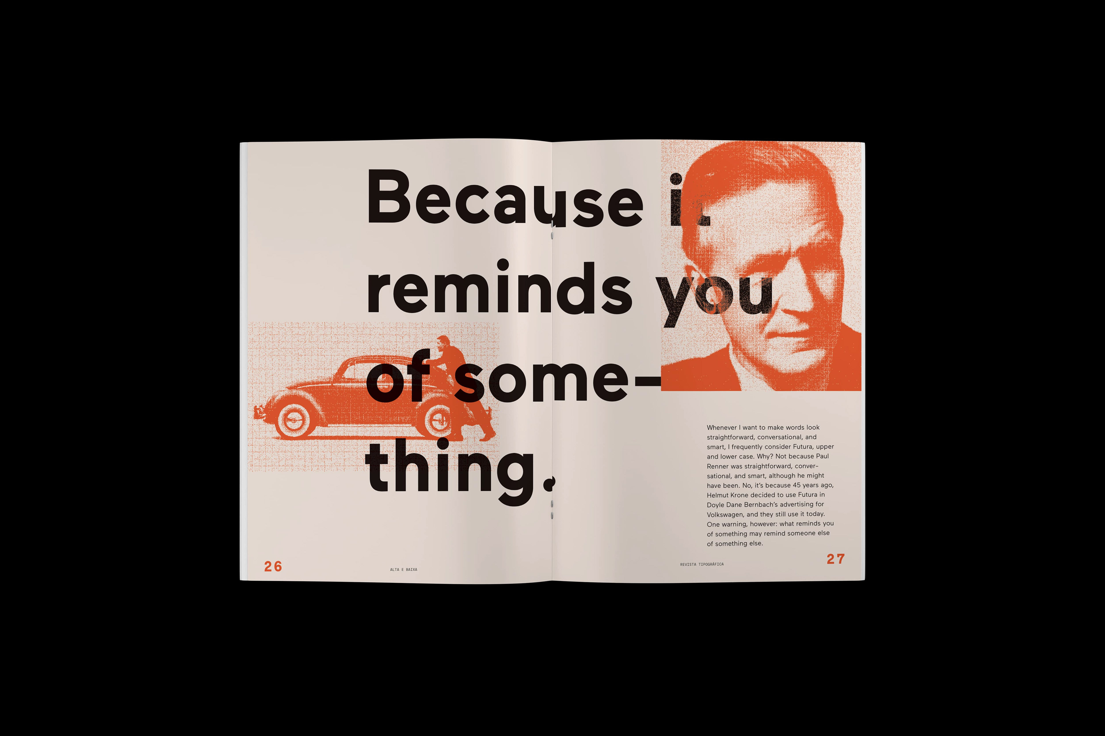
Alta e Baixa is a typography magazine that features 13 Ways of Looking at a Typeface, by Michael Beirut and typographic posters of Ignis Typeface (which can be seen in the posters page).
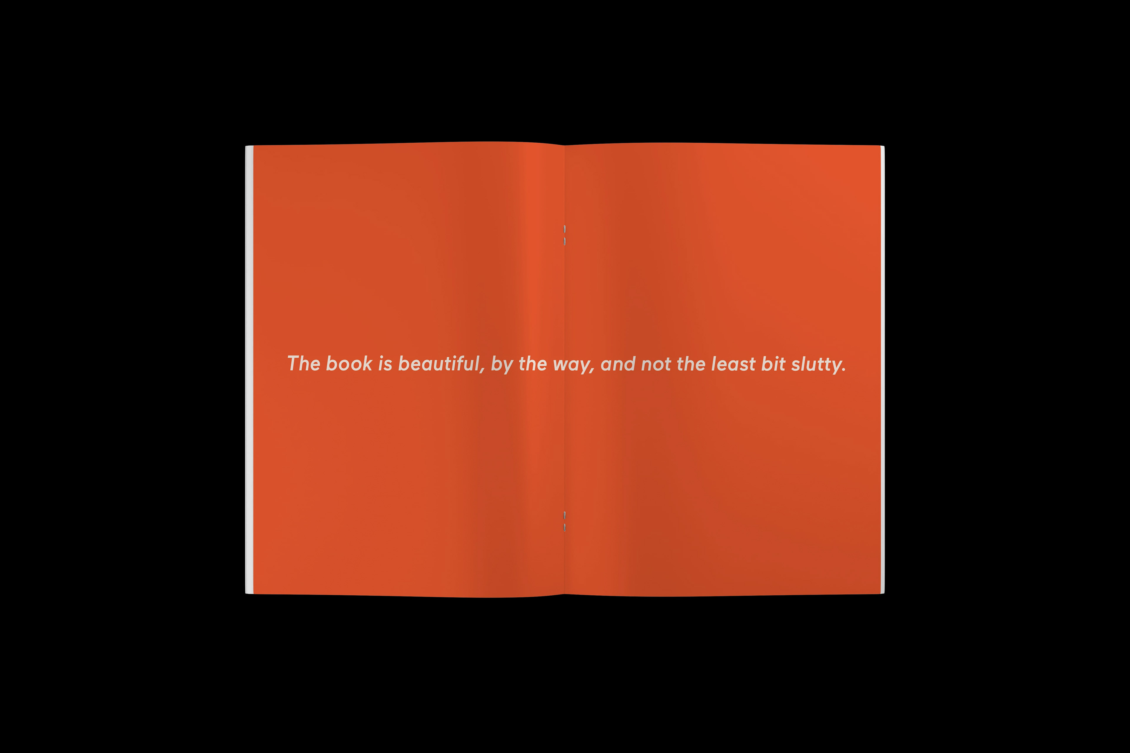
There is a sort of brutalist feeling to the layout, giving the magazine the feeling of rawness and truth, letting typography play the main role. That also justifies why only one color was used (even in images), and why it is fairly saturated. Images often float through the layouts, ignoring margins and orientation.
On the other hand, Typography seems to follow a strict grid, ignoring images under it. The goal is to mimic some kind of print-on-top-of-print effect, making it look like the pages were reused from previous prints, and so reminding us of the typographic industry.
Since we had time, we also created a web version of the magazine using Webflow.
This project was developed in collaboration with Sérgio Morgado within the scope of the Advanced Typography course, part of the Master in Design and Multimedia at the University of Coimbra (Coimbra, Portugal), and under the guidance of Professor Artur Rebelo.
February, 2021
February, 2021
—


